How Many Active Buffer Users Receive a lot of Comments?
comments
engagement
social-media
buffer
Author
Julian Winternheimer
Published
November 6, 2025
Overview
In this analysis we’ll explore comment engagement patterns across Buffer’s active users, looking specifically at these data points:
How many users reach different comment thresholds (25+, 50+, 100+, 200+, 500+, 1000+) each month
How these patterns vary by social network
How the distributions differ by billing plan
What We Found
Looking at data from the last complete month (October), we can see that a relatively low percentage of users receive a lot of comments in a given month. Most active users, around 85%, receive fewer than 25 comments across all of their posts, and the percentage of users reaching higher tiers of comment counts drops off substantially as we move up the scale.
25+ comments: 15.0% of active users
50+ comments: 9.3% of active users
100+ comments: 5.9% of active users
200+ comments: 3.8% of active users
500+ comments: 2.0% of active users
1,000+ comments: 1.3% of active users
There are significant differences across platforms as well. Threads shows the highest percentage of users getting at least 25 comments in a month, followed by X, Facebook, and Instagram. LinkedIn and Bluesky show lower percentages. These differences likely reflect a combination of platform algorithms, user behavior patterns, and the nature of content that performs well on each platform.
Finally, there’s a strong correlation between the user’s plan and the number of comments they receive. Only 8.6% of Free users get at least 25 comments in a month, but 30-36% of Essentials and Team customers get at least 25 comments. This relationship likely works in both directions. Users with larger audiences and higher engagement may be more motivated to invest in paid plans, while paid plans may also provide features and support that help users grow their engagement over time.
Data Collection
We’ll analyze monthly active users (those with at least one sent post per month) and their comment counts across channels for each of the last 12 months.
Code
# sql queryquery <-" with monthly_users as ( select date_trunc(sps.sent_at, month) as month , sps.organization_id , cbr.plan , sps.channel , sps.post_id , coalesce(pu.comments, pu.replies, 0) as total_comments from dbt_buffer.segment_post_sent as sps inner join dbt_buffer.publish_updates as pu on sps.post_id = pu.id left join dbt_buffer.core_organization_billing_records as cbr on sps.organization_id = cbr.organization_id where date(sps.sent_at) >= date_sub(current_date, interval 12 month) and sps.channel in ('twitter','facebook','instagram', 'threads','bluesky','linkedin') ) , user_monthly_totals as ( select month , organization_id , plan , channel , sum(total_comments) as monthly_comments , count(post_id) as posts_sent from monthly_users group by 1,2,3,4 ) select * from user_monthly_totals"# Execute querycomments_data <-bq_query(sql = query)
Overall Trends
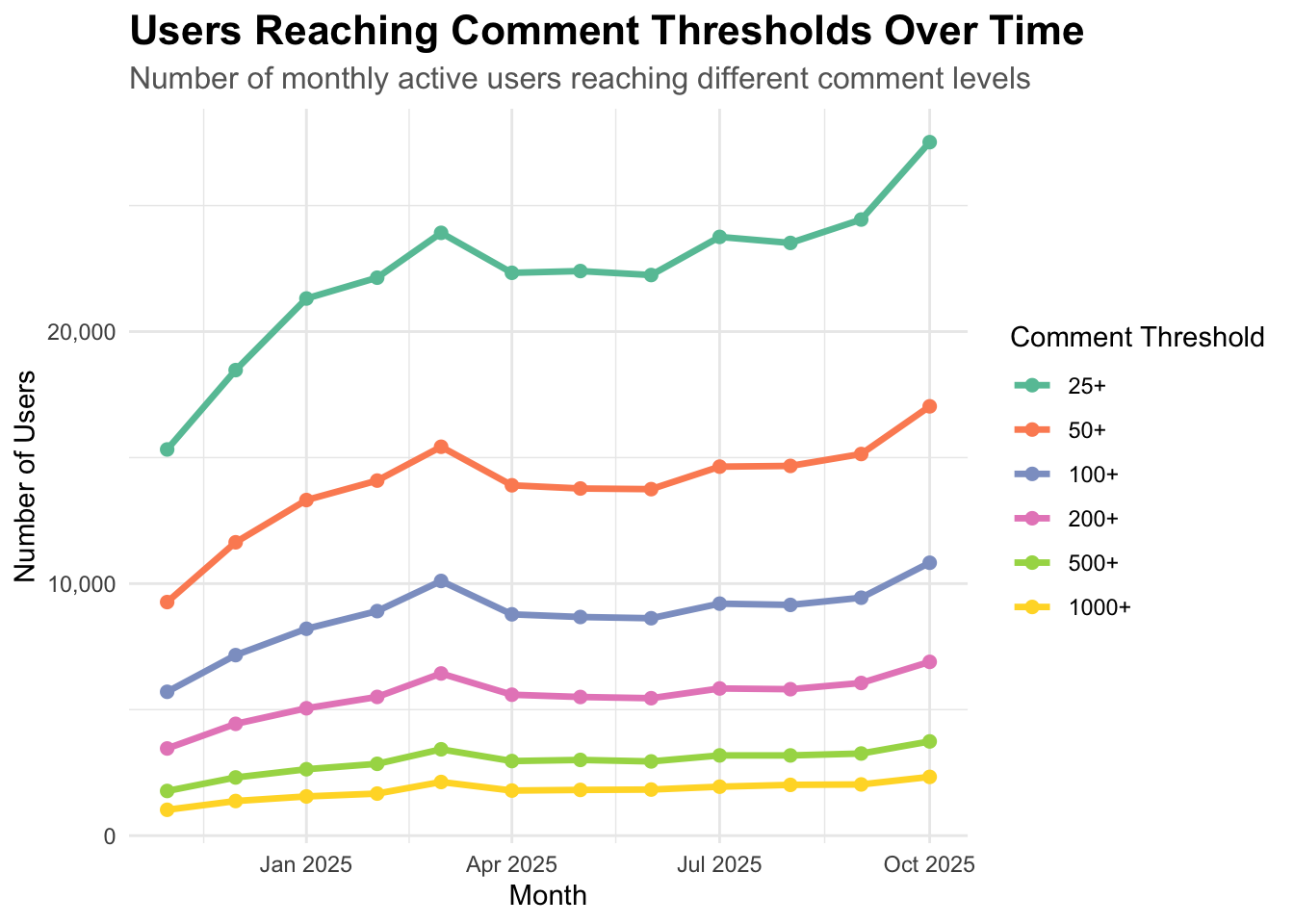
First we’ll look at how many users reach different comment thresholds each month across all channels.
The absolute numbers show that the count of users reaching each threshold has increased over the past year, with around 27.5K users (15% of MAU) getting at least 25 comments (total) across all of their posts in October.
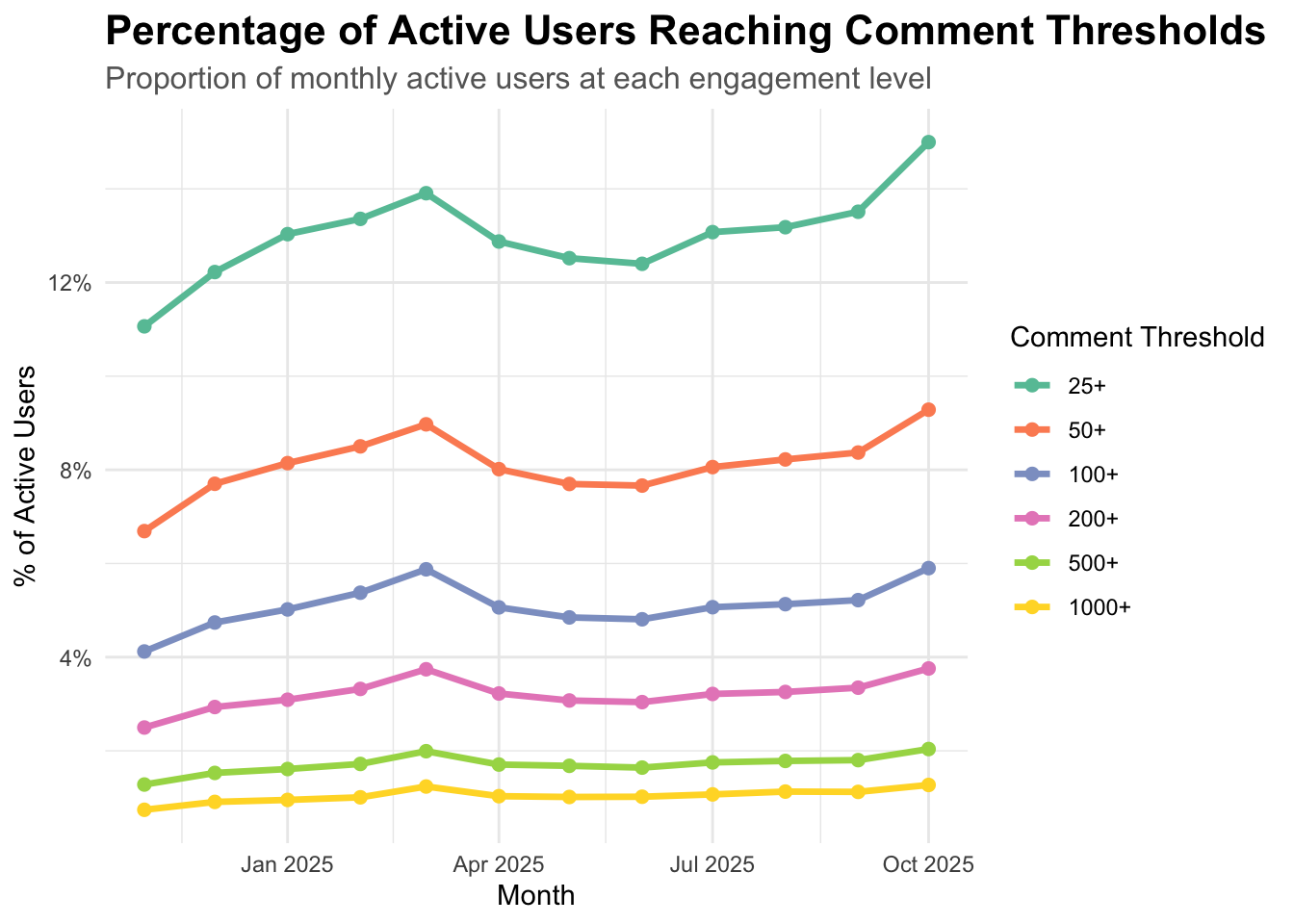
Percentage of Active Users
Looking at percentages rather than absolute counts, we can see that, as of October 2025, around 15% of active users had 25 or more comments, 9% had 50 or more, 6% had 100 or more, 4% had 200 or more, 2% had 500 or more, and 1% had 1000 comments or more.
Code
ggplot(threshold_counts, aes(x = month, y = pct_of_active, color = threshold)) +geom_line(size =1.2) +geom_point(size =2) +scale_y_continuous(labels =function(x) paste0(x, "%")) +scale_color_brewer(palette ="Set2") +labs(title ="Percentage of Active Users Reaching Comment Thresholds",subtitle ="Proportion of monthly active users at each engagement level",x ="Month",y ="% of Active Users",color ="Comment Threshold" ) +theme_minimal() +theme(plot.title =element_text(size =16, face ="bold"),plot.subtitle =element_text(size =12, color ="gray40"),legend.position ="right" )
Distribution of Comments
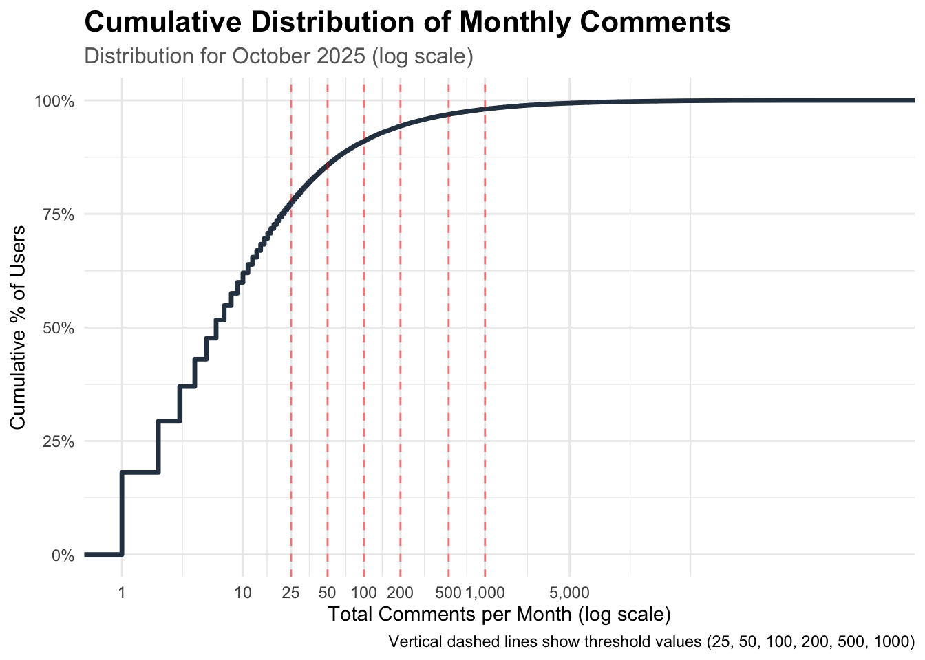
Next we’ll examine the overall distribution of comments to understand where most users fall. The cumulative distribution shows that the vast majority of users fall below our lowest threshold. The curve is steep at the lower end and flattens out as we move to higher comment counts, which is typical of engagement metrics. By the time we reach 25 comments, we’re already at around the 85th percentile, meaning that most users receive 24 or fewer comments per month.
Code
# Use most recent complete month for CDFlatest_month <-max(comments_data$month[comments_data$month <"2025-10-31"])comments_latest <- comments_data %>%filter(month == latest_month) %>%group_by(organization_id) %>%summarise(total_comments =sum(monthly_comments))ggplot(comments_latest, aes(x = total_comments)) +stat_ecdf(geom ="step", size =1.2, color ="#2C3E50") +geom_vline(xintercept = thresholds,linetype ="dashed",color ="red",alpha =0.5) +scale_x_log10(labels = comma, breaks =c(1, 10, 25, 50, 100, 200, 500, 1000, 5000)) +scale_y_continuous(labels = percent) +labs(title ="Cumulative Distribution of Monthly Comments",subtitle =paste0("Distribution for ", format(latest_month, "%B %Y"), " (log scale)"),x ="Total Comments per Month (log scale)",y ="Cumulative % of Users",caption ="Vertical dashed lines show threshold values (25, 50, 100, 200, 500, 1000)" ) +theme_minimal() +theme(plot.title =element_text(size =16, face ="bold"),plot.subtitle =element_text(size =12, color ="gray40") )
Channel Breakdown
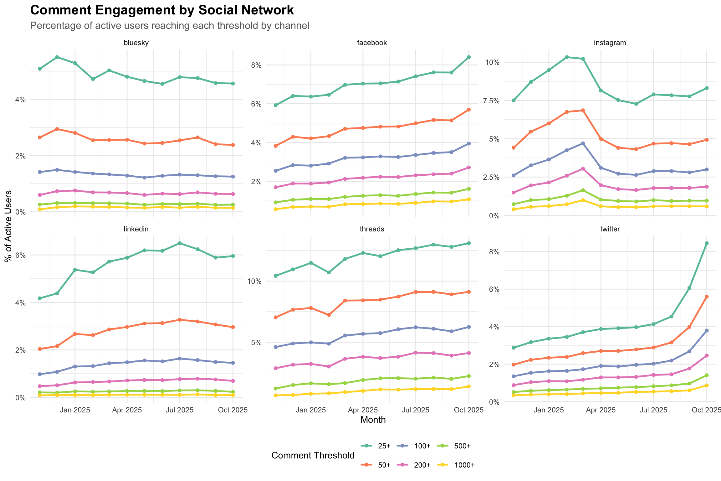
The channel breakdown reveals some interesting patterns. Threads consistently shows the highest percentage of users receiving at least 25 comments at around 13%. This makes sense, as Threads really tries to get its users replying in comments.
X, Facebook, and Instagram are clustered around 8-9% for the 25+ threshold, but X has been growing very quickly in recent months.
LinkedIn is around 6%, which is lower than we might expect given its nature as a text-based platform. Bluesky shows the lowest percentages across all thresholds at around 4.6%, though this is likely due to the platform’s smaller overall user base and more niche community.
# All channelschannel_thresholds %>%ggplot(aes(x = month, y = pct_of_active, color = threshold)) +geom_line(size =1) +geom_point(size =1.5) +facet_wrap(~channel, scales ="free_y") +scale_y_continuous(labels =function(x) paste0(x, "%")) +scale_color_brewer(palette ="Set2") +labs(title ="Comment Engagement by Social Network",subtitle ="Percentage of active users reaching each threshold by channel",x ="Month",y ="% of Active Users",color ="Comment Threshold" ) +theme_minimal() +theme(plot.title =element_text(size =16, face ="bold"),plot.subtitle =element_text(size =12, color ="gray40"),legend.position ="bottom" )
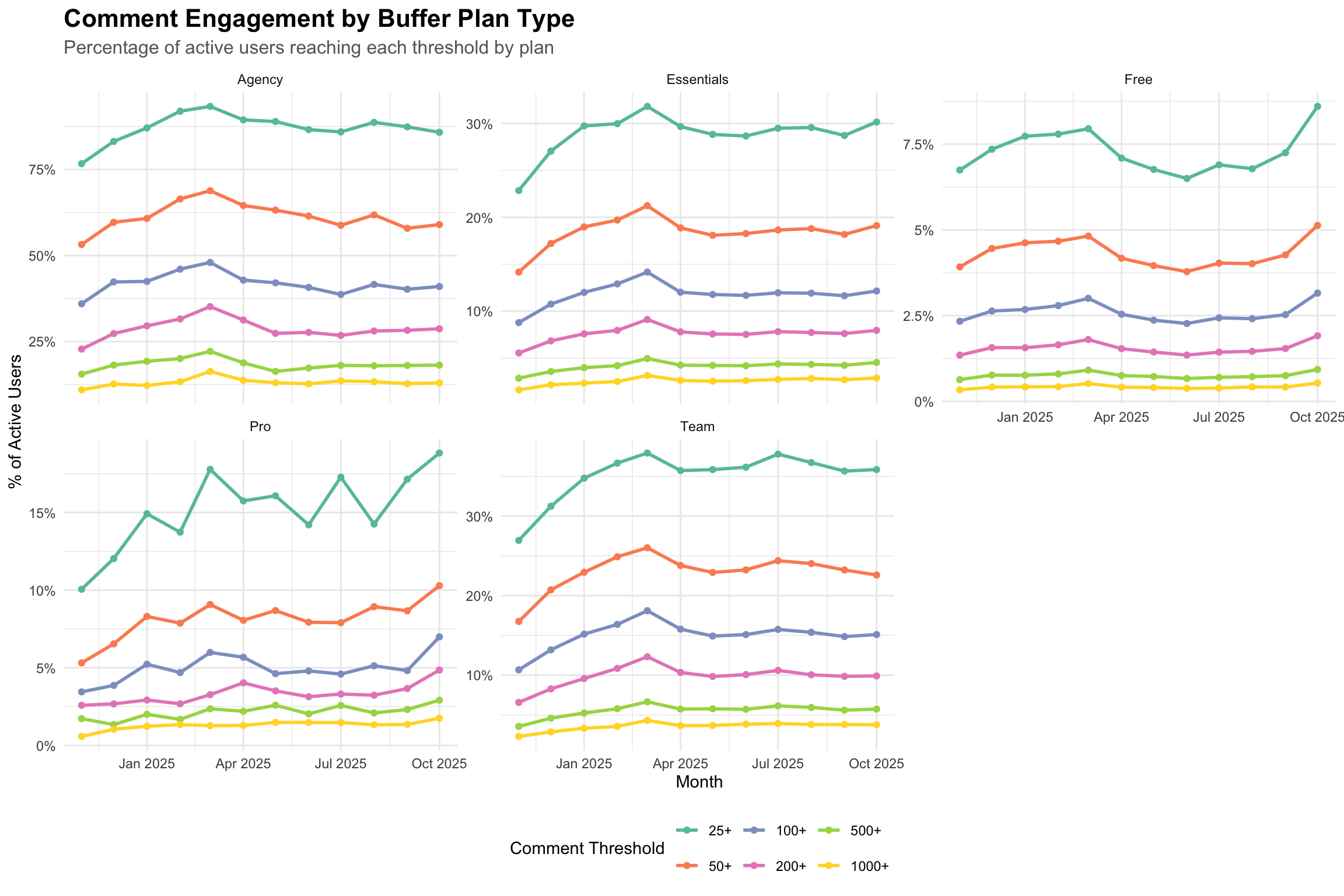
Plan Type Analysis
There’s a clear relationship between plan type and the number of comments received. Free users show the lowest percentages across all thresholds, with only around 9% getting 25 or more comments.
This percentage increases significantly for paid plans. Around 30% of Essentials customers and 36% of Team customers get at least 25 comments in a month. Agencies have even higher percentages, with 85-90% of users hitting the 25+ comment mark.
This pattern likely reflects a combination of factors. Users on higher-tier plans may have larger audiences, more established brands, or be more serious about their social media presence. It’s also possible that users who see strong engagement are more likely to invest in paid plans to manage that engagement more effectively.
# Filter to major plan types by user counttop_plans <- plan_thresholds %>%group_by(plan) %>%summarise(avg_users =mean(total_active_users)) %>%arrange(desc(avg_users)) %>%head(5) %>%pull(plan)plan_thresholds %>%filter(plan %in% top_plans) %>%ggplot(aes(x = month, y = pct_of_active, color = threshold)) +geom_line(size =1) +geom_point(size =1.5) +facet_wrap(~plan, scales ="free_y") +scale_y_continuous(labels =function(x) paste0(x, "%")) +scale_color_brewer(palette ="Set2") +labs(title ="Comment Engagement by Buffer Plan Type",subtitle ="Percentage of active users reaching each threshold by plan",x ="Month",y ="% of Active Users",color ="Comment Threshold" ) +theme_minimal() +theme(plot.title =element_text(size =16, face ="bold"),plot.subtitle =element_text(size =12, color ="gray40"),legend.position ="bottom" )
Conclusion
This analysis reveals several patterns about comment engagement across Buffer users.
First, high comment engagement is relatively uncommon. Only about 15% of active users receive 25 or more comments per month, and this percentage drops quickly as we increase the comment threshold.
Second, there are meaningful differences across platforms. Threads shows the highest percentage of users getting at least 25 comments in a month, followed by X, Facebook, and Instagram. LinkedIn and Bluesky show lower percentages. These differences likely reflect a combination of platform algorithms, user behavior patterns, and the nature of content that performs well on each platform.
Third, there’s a strong correlation between the user’s plan and the number of comments they receive. Only 8.6% of Free users get at least 25 comments in a month, but 30-36% of Essentials and Team customers get at least 25 comments. This relationship likely works in both directions. Users with larger audiences and higher engagement may be more motivated to invest in paid plans, while paid plans may also provide features and support that help users grow their engagement over time.
Methodology Notes
Data source: Buffer’s publish_updates and segment_post_sent tables via BigQuery
Time period: 12 months of data
Comment calculation: Sum of replies and comments fields
Active users: Users with at least one sent post in a given month
Analysis granularity: Monthly aggregation by user and channel